Architecting an Architect’s Brand & Website
Client: TRBC
As we evolved and civilisations grew, we erected increasingly elaborate shelters for ourselves. The earliest caves and their paintings (I try hard to not call it decor) tell us stories of the life of Homo Erectus and before. Spaces that we inhabit play an integral role — dictating more than just habitation whilst simultaneously affecting our mental and emotional health. The symbiosis between elements human and spatial are forever in flux, influencing each other — moulding the world around us and consequently being moulded by it.
When you come across a passionate architect, you realise that you’ve been taking all of the above for granted. The proverbial brick and mortar are alive and talking, only if we were patient enough to listen. So let’s put it out there, Kwa:zi loves architecture. Digital design feels like a younger sibling to architecture. Constantly in awe, yet in denial of the love we share.
Our sibling is TRBC, an architecture studio based out of Chandigarh. A few years older than us, TRBC is not the toddler we are. They’re in middle school now and they’re beginning to get noticed. A casual conversation with the Founder, Amri Chadha/Grewal, led us down the exciting ski slope of designing and developing a website for them. Itstarted as a fairly simple project taking many dramatic twists and turns, ending up with us presenting them a new website as well as a visual identity for their brand (plot twist??!!).
It goes without saying that when you work with people you know, you tend to believe in their vision more than someone you’ve just met. Amri has an ambitious blueprint (architecture joke) for where she wants to take TRBC. We believe in her. And, we believe in the impact of architecture. Amri’s passion comes across clearly in her obsession with meticulous attention to detail. So when we made our initial prototype for the website, she enjoyed the visual engagement it offered and that we too, cared about detail. Have a peek:
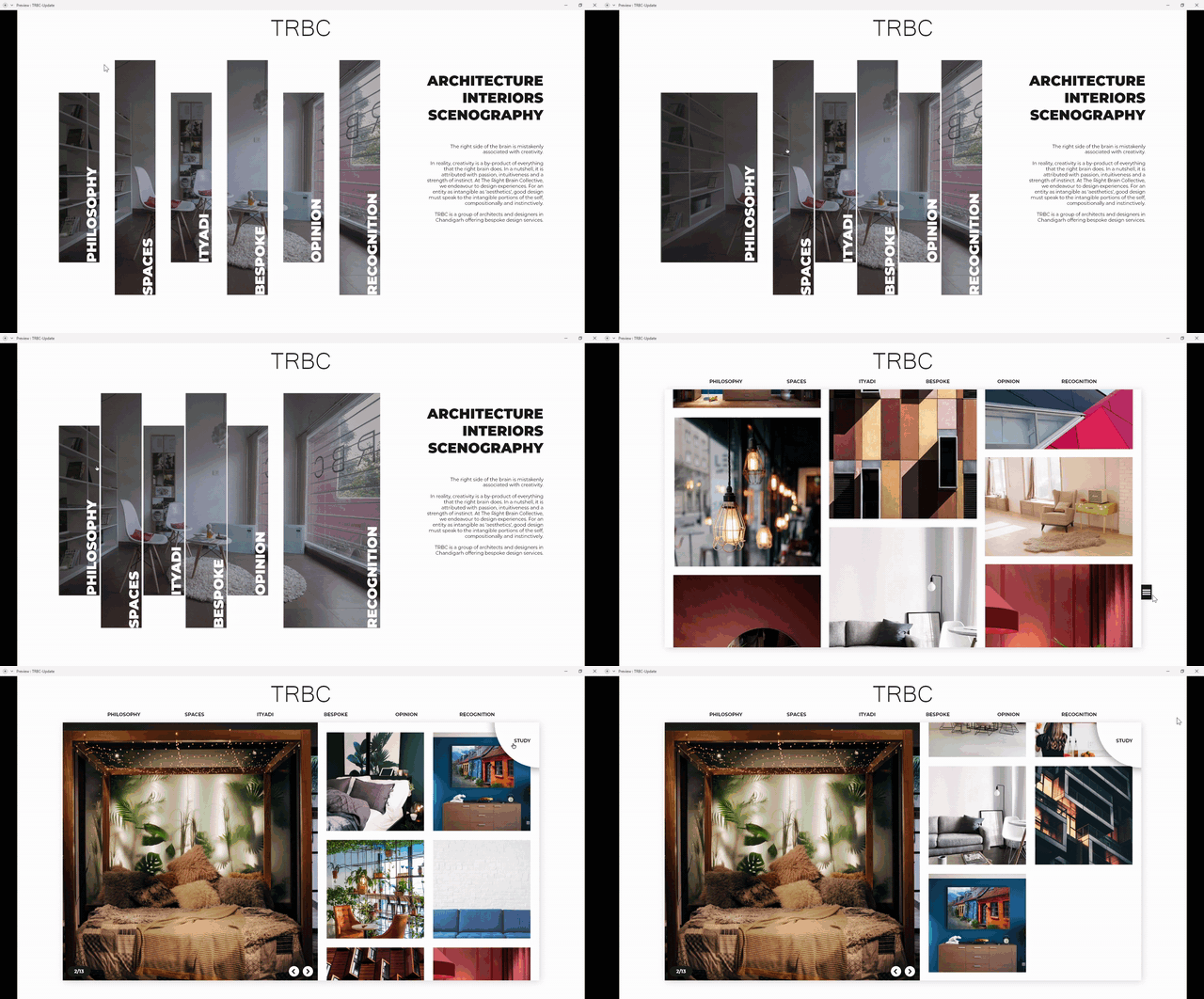
Unfortunately, the above iteration was made without a brief to merely get Amri excited about the idea of a new website. Hence, we were back to the drawing board summoning another unique and visually engaging concept to play with — a minimal yet eloquent interface. We did a pretty good job of it till we realised we faced some development issues that required budgetary flexibility that was not on our agenda. Here’s the second design we did for TRBC:

Being pushed to develop a third concept, I took the courageous liberty of suggesting a new brand identity for TRBC, to Amri. She seemed not immediately put off by the idea, which was motivating. Moreover, we made a strong case — “if we want the website to have a strong character, then the brand must be a part of it, so why don’t we visualise both elements in tandem and then see what outcomes we can create”. Amri agreed readily, as long as she could veto anything and everything.
The design team got to it, exploring the absolute ends of architectural symbolism as well as minimal simplicity. Here’s a peek into our drawing board, an insight into the explorations:

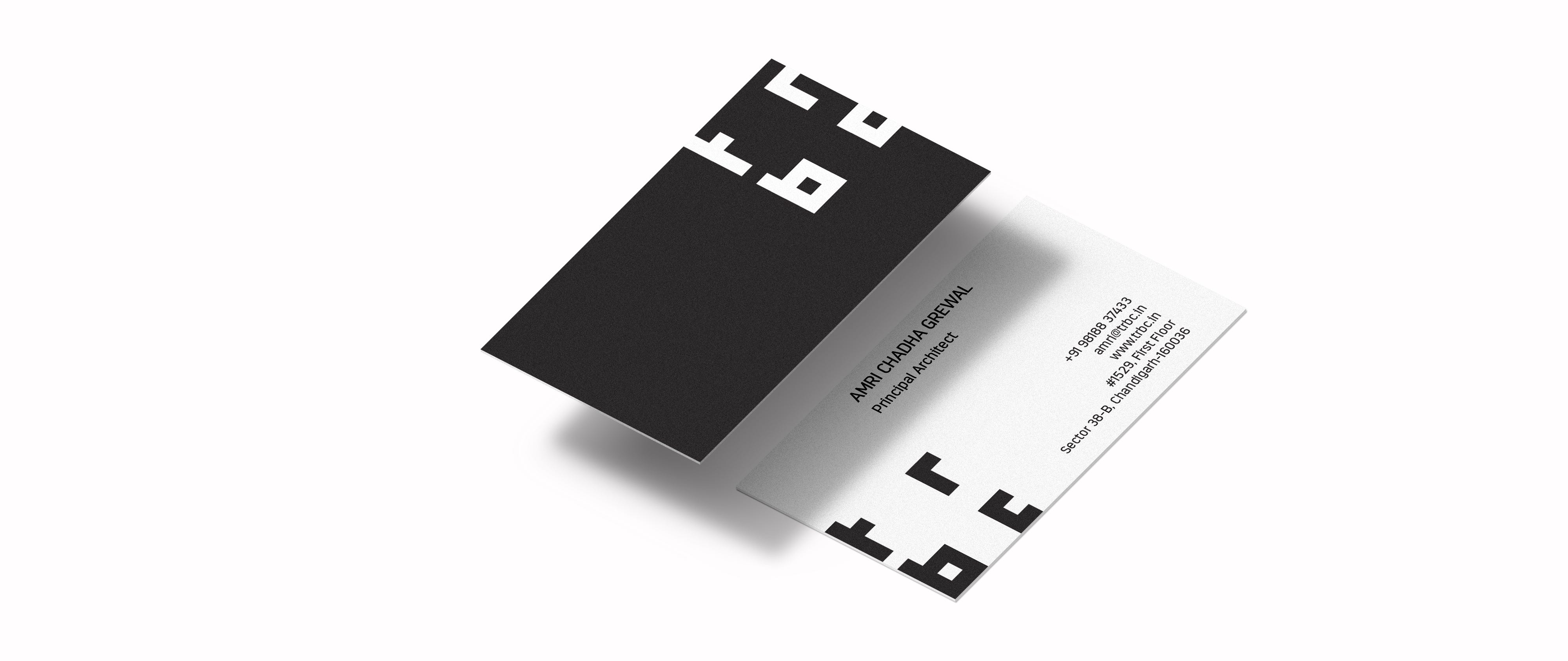
Amri fell for one option immediately. The one that echoed a sense of timelessness. The one that would suit her with grey hair too. The one that could someday quite as easily represent a successful and confident organisation. The one that allowed us a strong concept to fuse with our idea of an engaging website. Here’s what the new TRBC looks like today:
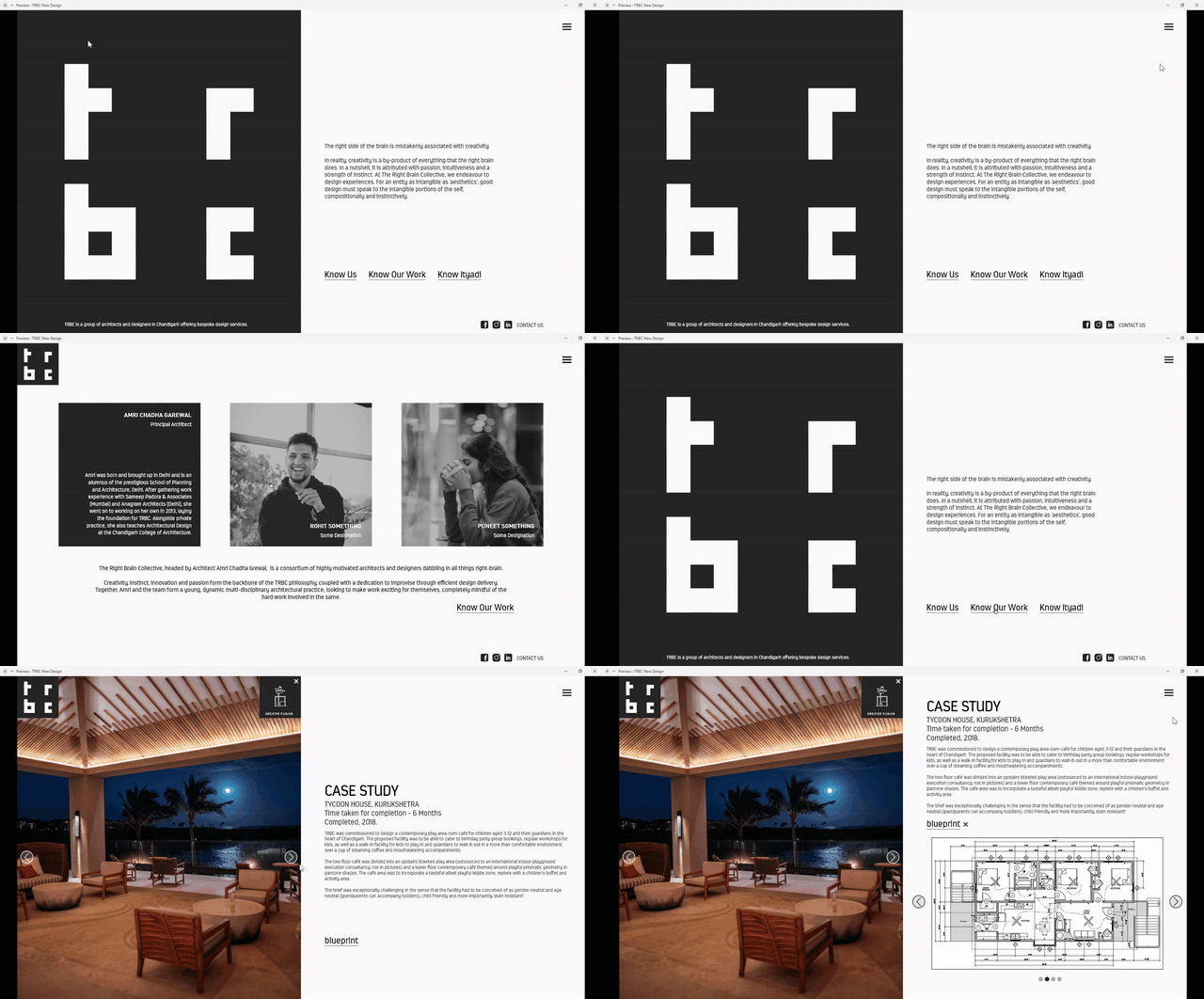
There’s nothing like the real thing — http://trbc.in/
Parting notes:
As we continue to work with a wide spectrum of entrepreneurs and professionals, we too grow with their respective brands by learning through their critical feedback while constantly try to surpass expectations.
The young and driven, like Amri, catalyse their peers in a way that encourages us all to build our skyscrapers. It’s been challenging and exciting to bring into existence a brand and digital experience for people who believe, in ideas big and small, intentionally or unintentionally encouraging us to believe too.


