Pee Safe

About the Brand
A high on engagement brand, Pee Safe has carved its niche in the lives (and bags) of women with revolutionary products.
In their journey beyond just Pee Safe brand products (and toilet hygiene), the organization found itself facing an interesting challenge – how does a web app reflect their ambitions (as well as vast new product ranges) more effectively?
Peesafe: Comfort & Care Everyday
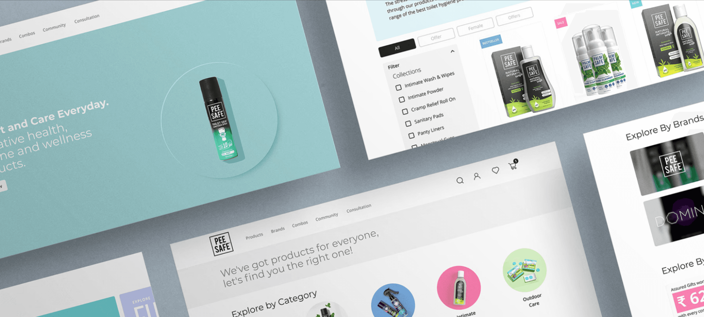
Our association with Pee Safe has been an exploration into the world of customer-first, experience-driven design. While it has been challenging to put this expansive brief into an easy to understand and navigate format, we’d like to highlight the critical perspectives that led us to this solution.


Analyzing Human Behavior
Consumer behavior is the basis for UX design today, yet it is largely underutilized. Finding the right balance between UX and UI is a tussle nobody can avoid. More often than not we end up siding with User Interface as the primary way of judging a web app since the medium is visual and tangible. But our users look beyond, their actions, intuitions function on patterns, hierarchies and biases. They can distinguish between good and bad UI/UX design based on the anchoring point of market leaders – Amazon, Flipkart, Lenskart, Swiggy and the likes. These benchmarks may vary in User Interface design from each other but have excellent User Experience. This allows their user to accomplish a task without much thought, relying on pattern-like behavior. For the build, we went deep into understanding the Customer Personas of the Pee Safe buyer and their motivations. We used that as the north star for everything. Everything. Some of the methods we applied to enable discovery were Product Usage Analytics, Empathy Maps, Stakeholder Interviews, Customer Journey & Persona Mapping, Design Thinking Workshops with various Pee Safe team-members (many of whom directly engage with customers or their metrics – customer support, marketplace management, marketing et al) The information generated out of this was integral to building experiential pathways for the future of the product. User centric wireframe for PeesafeA simple yet user centric wireframe for building an Experience of Comfort & Care.


Peesafe mobile first website UI design
We placed at the center of our build a learning-oriented approach to UX. We ensured the User through their journey could be nudged and motivated to understand products. Some easy to know steps were:
A robust search module with suggested CTA’s.
Relevant blogs and testimonials on catalogue pages to give a broader perspective on product quality.
How To Use videos on all product pages which gave visual reference to the products.
A step by step, decision process customer journey for Users to easily find the products they want.
Segregated brand pages NOT focused on selling but acquainting the user with the method of each brand and what it represents.
To make customers believe that we were invested in their comfort and care, we started by making their digital experience simpler, guided and educational.
The future of the Pee Safe house of brands is now strengthened by a capable design system and user experience. It allows the organization to now build on the shoulders of a good product and envision more complex systems and interactions for their audience. Loyalty programs, educational and learning-based approaches to buying, robust profiles that could be gamified, all now seem like viable propositions.
A successful UI/UX build cannot be judged by the immediate response it may get. Its evaluation rests on the scalability of design and technology to make way for continually simpler and meaningful buying experiences.

Client
PIZONI
Location
Sector
Discipline
Share

