We present the effort of documenting Kolkata’s visual history, particularly focusing on type design. The lens we view this through is shaped strongly by the values and aesthetics of Kwazi as a design organisation. We have tried to maintain the integrity of spaces, signs and establishments to the best of our

ability.

TYPE

TYPE

LIKE

LIKE

KOLKATA

KOLKATA

This publication is just the beginning of a longer journey in documenting the versatile

and impressive artistic culture across India, viewed from the perspective of design.

This publication is just the beginning of a longer journey in documenting the versatile and impressive artistic culture across India, viewed from the perspective of design.

Loading...
Loading...
Loading...

Drag to flip pages

Bringing more than a century of design to these pages. Experienced, explored, enjoyed but never celebrated. Here we are, creating a visual documentary of the typographic heritage of a city like no other.

Bringing more than a century of design to these pages. Experienced, explored, enjoyed but never celebrated. Here we are, creating a visual documentary of the typographic heritage of a city like no other.

Team Kwazi

ABOUT

ABOUT

THE

THE

INITIATIVE

INITIATIVE

Walking through Kolkata reveals a quiet beauty in the everyday. 
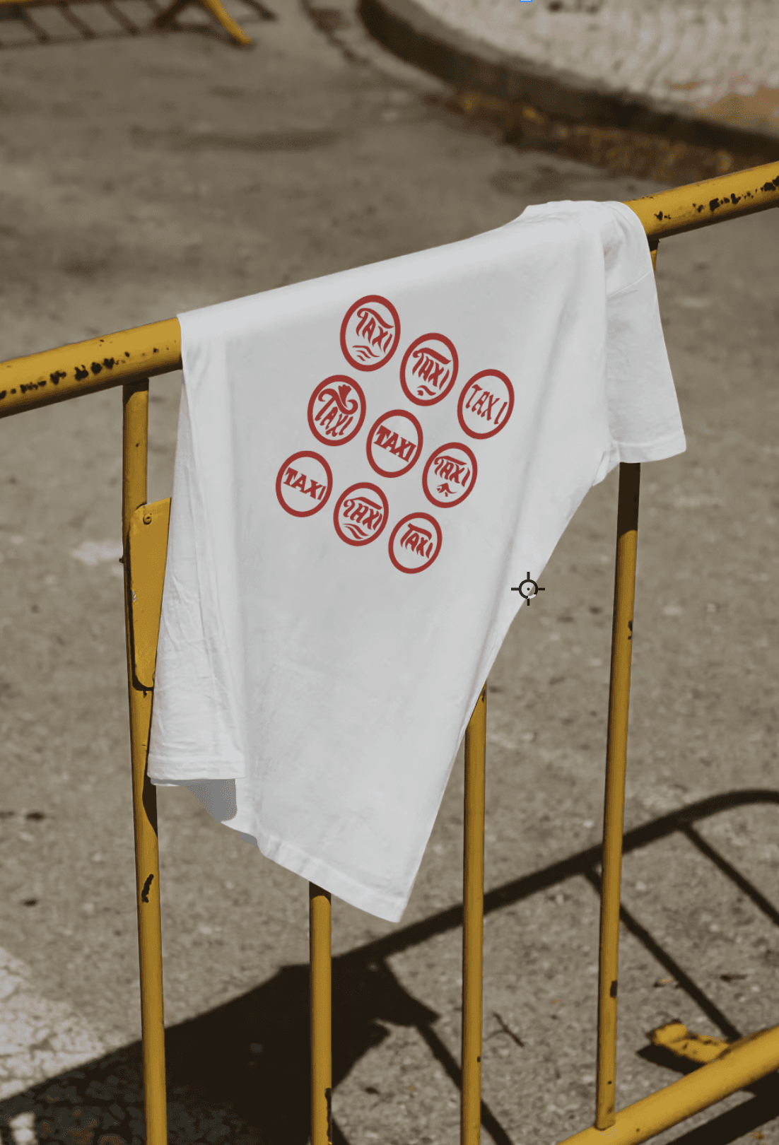
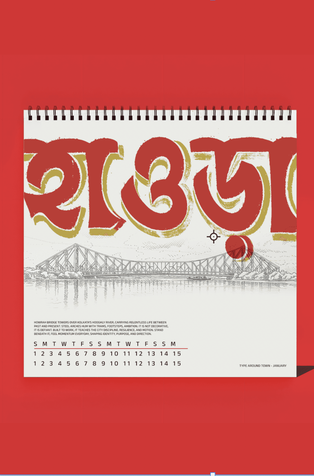
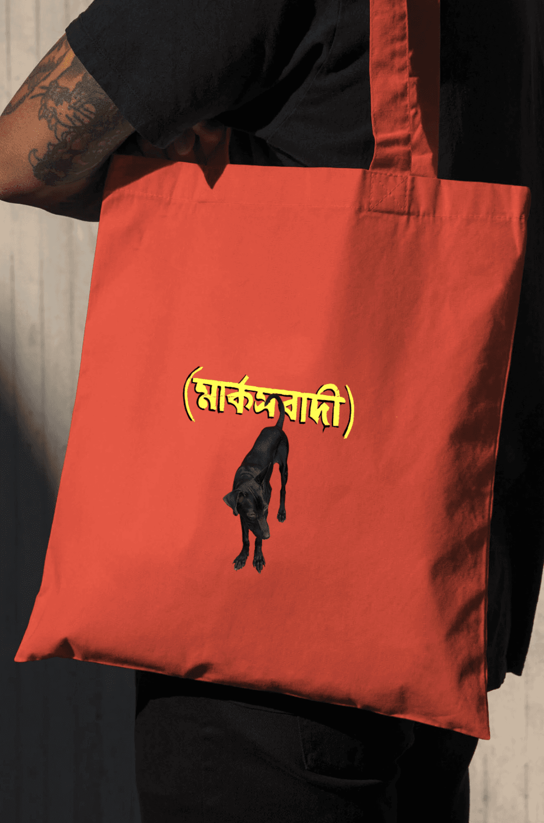
Beyond the architecture and chaos, typography stood out. Storefronts, street signs, graffiti, and logos form a living archive of letterforms, each carrying its own story. Documenting these overlooked details became an ongoing exploration, shaped through multiple iterations and driven by deep respect for the city’s visual culture.

2024

Edition of 1 Plus and additional artist Proof

2024

Edition of 1 Plus and additional artist Proof

2024

Edition of 1 Plus and additional artist Proof

2024

Edition of 1 Plus and additional artist Proof

2024

Edition of 1 Plus and additional artist Proof

2024

Edition of 1 Plus and additional artist Proof

2024

Edition of 1 Plus and additional artist Proof

2024

Edition of 1 Plus and additional artist Proof

2024

Edition of 1 Plus and additional artist Proof

2024

Edition of 1 Plus and additional artist Proof

2024

Edition of 1 Plus and additional artist Proof

2024

Edition of 1 Plus and additional artist Proof

2024

Edition of 1 Plus and additional artist Proof

2024

Edition of 1 Plus and additional artist Proof

2024

Edition of 1 Plus and additional artist Proof

2024

Edition of 1 Plus and additional artist Proof

2024

Edition of 1 Plus and additional artist Proof

2024

Edition of 1 Plus and additional artist Proof

2024

Edition of 1 Plus and additional artist Proof

2024

Edition of 1 Plus and additional artist Proof

2024

Edition of 1 Plus and additional artist Proof

2024

Edition of 1 Plus and additional artist Proof

2024

Edition of 1 Plus and additional artist Proof

2024

Edition of 1 Plus and additional artist Proof

2024

Edition of 1 Plus and additional artist Proof

2024

Edition of 1 Plus and additional artist Proof

2024

Edition of 1 Plus and additional artist Proof

2024

Edition of 1 Plus and additional artist Proof

2024

Edition of 1 Plus and additional artist Proof

2024

Edition of 1 Plus and additional artist Proof

TYPE

LIKE

KOLKATA

During a design project at Kwazi, we began researching the typographical representation in Calcutta with the hope of creating a brand inspired by it.

TYPE

LIKE

KOLKATA

People Behind

TYPE

TYPE

AROUND

AROUND

TOWN

TOWN

Hello! We’re Kwazi. An agency but not really an agency. Self-definition has been hard, we’ve worn many hats - some cooler than others. All of it to realise we’re first and foremost partners (in creativity and design). Our definition starts and ends with the work we do, the brands we build and the problems we solve. We're whatever you'd like us to be.

CORE TEAM

Arshdeep

Editor-in-Chief

Arshdeep

Editor-in-Chief

Arshdeep

Editor-in-Chief

Shubhendu

Editor & Creative Lead

Shubhendu

Editor & Creative Lead

Shubhendu

Editor & Creative Lead

Swayam

Editorial Designer

Swayam

Editorial Designer

Swayam

Editorial Designer

CONTRIBUTORS

Aditti

Illustrator

Aditti

Illustrator

Aditti

Illustrator

Vanya

Editorial Designer

Vanya

Editorial Designer

Vanya

Editorial Designer

Purvi

Visual Designer

Purvi

Visual Designer

Purvi

Visual Designer

Paavani

Visual Designer

Paavani

Visual Designer

Paavani

Visual Designer

The
Photographer

The
Photographer

Rishi is a documentary photographer and heritage enthusiast, often indulging in projects relating to history, culture and architecture. He grew up in Kolkata and has explored every nook and corner of the city throughout his childhood. Currently based out of Hyderabad, he has worked on projects for architects, historians and artisans in Calcutta, Delhi, and Hyderabad.

Type Around Kolkata

Type Around Kolkata

Type Around Kolkata

Type in
your Pocket

Type in
your Pocket

Type in
your Pocket

During a design project at Kwazi, we began researching the typographical representation in Calcutta with the hope of creating a brand inspired by it. This study slowly became a sweet obsession - with us unable to stop, seeking and discovering the richness of type design prevalent across the cityscape.

During a design project at Kwazi, we began researching the typographical representation in Calcutta with the hope of creating a brand inspired by it. This study slowly became a sweet obsession - with us unable to stop, seeking and discovering the richness of type design prevalent across the cityscape.

During a design project at Kwazi, we began researching the typographical representation in Calcutta with the hope of creating a brand inspired by it. This study slowly became a sweet obsession - with us unable to stop, seeking and discovering the richness of type design prevalent across the cityscape.

Abstract blue shapes create an interesting pattern.

Grid Typography Postcard

Letters Sourced from all over Kolkata

Download

high-angle photography of stairs

Hand Painted Bus Postcard

Designed from the signature handpanted typography on Calcutta Busses

Download

a planet in space

Swipe Card Stack.

Swipe through layered cards with smooth gestures and full control.

Download

a blue and white fish

Swipe Card Stack.

Swipe through layered cards with smooth gestures and full control.

Download

Read More About Type

speaker with a half white half green background
futuristic robot with a grey background
abstract orange butterfly with a light blue background
white oval shape with a black background
material samples on a grey surface

THE ART OF NOTICING TYPE

speaker with a half white half green background
futuristic robot with a grey background
abstract orange butterfly with a light blue background
white oval shape with a black background
material samples on a grey surface

THE ART OF NOTICING TYPE

speaker with a half white half green background
futuristic robot with a grey background
abstract orange butterfly with a light blue background
white oval shape with a black background
material samples on a grey surface

THE ART OF NOTICING TYPE