Curryit:
Designing the Framework for an emerging D2C Brand
Client
Curryit
Location
Delhi
Industry
FMCG
Discipline
Branding & Visual Design
Curryit:
Designing the Framework for an emerging D2C Brand
Client
Curryit
Location
Delhi
Sector
FMCG
Discipline
Branding & Visual Design
Curryit:
Designing the Framework for an emerging D2C Brand
Client
Curryit
Location
Delhi
Industry
FMCG
Discipline
Branding & Visual Design
What started as a shared passion for Indian food between two founders soon became a mission to make authentic Indian cooking easier for everyone. They noticed that while people loved the rich flavours of regional Indian cuisine, recreating them at home often required time, expertise, and a long list of ingredients.
That's why they created Curryit, a clean-label food brand that takes the complexity out of cooking while keeping the soul of the recipe intact. Today, Curryit offers ready-to-cook curries, cooking pastes, regional masalas, chutneys, and more, helping people cook real Indian food with ease, confidence, and pride.
What started as a shared passion for Indian food between two founders soon became a mission to make authentic Indian cooking easier for everyone. They noticed that while people loved the rich flavours of regional Indian cuisine, recreating them at home often required time, expertise, and a long list of ingredients.
That's why they created Curryit, a clean-label food brand that takes the complexity out of cooking while keeping the soul of the recipe intact. Today, Curryit offers ready-to-cook curries, cooking pastes, regional masalas, chutneys, and more, helping people cook real Indian food with ease, confidence, and pride.
What started as a shared passion for Indian food between two founders soon became a mission to make authentic Indian cooking easier for everyone. They noticed that while people loved the rich flavours of regional Indian cuisine, recreating them at home often required time, expertise, and a long list of ingredients.
That's why they created Curryit, a clean-label food brand that takes the complexity out of cooking while keeping the soul of the recipe intact. Today, Curryit offers ready-to-cook curries, cooking pastes, regional masalas, chutneys, and more, helping people cook real Indian food with ease, confidence, and pride.
Overview
As Curryit expanded across categories and introduced a growing range of products, they partnered with us to refresh their brand identity, develop a scalable packaging system across multiple SKUs, and define a stronger brand communication strategy. The goal was to create a cohesive and future-ready brand experience that could unify their expanding portfolio while clearly communicating what makes Curryit unique.
Overview
As Curryit expanded across categories and introduced a growing range of products, they partnered with us to refresh their brand identity, develop a scalable packaging system across multiple SKUs, and define a stronger brand communication strategy. The goal was to create a cohesive and future-ready brand experience that could unify their expanding portfolio while clearly communicating what makes Curryit unique.
Overview
As Curryit expanded across categories and introduced a growing range of products, they partnered with us to refresh their brand identity, develop a scalable packaging system across multiple SKUs, and define a stronger brand communication strategy. The goal was to create a cohesive and future-ready brand experience that could unify their expanding portfolio while clearly communicating what makes Curryit unique.

Logo Update
The logo required a careful evolution rather than a complete redesign. Working within the constraints of an existing and recognised mark, we refined it into a cleaner, more minimal, sticker-like identity while preserving its familiarity and equity. To improve flexibility across packaging and brand applications, we developed both stacked and in-line logo variations, ensuring the identity could adapt seamlessly across a wide range of formats while maintaining consistency and recognition.
Logo Update
The logo required a careful evolution rather than a complete redesign. Working within the constraints of an existing and recognised mark, we refined it into a cleaner, more minimal, sticker-like identity while preserving its familiarity and equity. To improve flexibility across packaging and brand applications, we developed both stacked and in-line logo variations, ensuring the identity could adapt seamlessly across a wide range of formats while maintaining consistency and recognition.
Logo Update
The logo required a careful evolution rather than a complete redesign. Working within the constraints of an existing and recognised mark, we refined it into a cleaner, more minimal, sticker-like identity while preserving its familiarity and equity. To improve flexibility across packaging and brand applications, we developed both stacked and in-line logo variations, ensuring the identity could adapt seamlessly across a wide range of formats while maintaining consistency and recognition.


Tagline
Through extensive research, customer conversations, and strategic exploration with the founders, we uncovered "Real" as the core of Curryit's brand proposition. From ingredients and recipes to flavour and cooking experiences, authenticity consistently emerged as the strongest driver of trust and preference.
Combined with the brand's strengths of ease and great taste, this insight led to the creation of the tagline "Real Taste. Real Easy." , a simple yet powerful platform that captures Curryit's commitment to making authentic Indian cooking accessible to everyone.
Tagline
Through extensive research, customer conversations, and strategic exploration with the founders, we uncovered "Real" as the core of Curryit's brand proposition. From ingredients and recipes to flavour and cooking experiences, authenticity consistently emerged as the strongest driver of trust and preference.
Combined with the brand's strengths of ease and great taste, this insight led to the creation of the tagline "Real Taste. Real Easy." , a simple yet powerful platform that captures Curryit's commitment to making authentic Indian cooking accessible to everyone.
Tagline
Through extensive research, customer conversations, and strategic exploration with the founders, we uncovered "Real" as the core of Curryit's brand proposition. From ingredients and recipes to flavour and cooking experiences, authenticity consistently emerged as the strongest driver of trust and preference.
Combined with the brand's strengths of ease and great taste, this insight led to the creation of the tagline "Real Taste. Real Easy." , a simple yet powerful platform that captures Curryit's commitment to making authentic Indian cooking accessible to everyone.


Packaging
Inspired by the brand's positioning around real taste and effortless cooking, and informed by the unique strengths of each product category, we developed a scalable packaging system that could serve diverse consumer needs. Every SKU was thoughtfully designed with its own visual cues, colour palette, and hierarchy, helping shoppers quickly navigate the range while reinforcing the authenticity, convenience, and trust that define the Curryit brand.
Packaging
Inspired by the brand's positioning around real taste and effortless cooking, and informed by the unique strengths of each product category, we developed a scalable packaging system that could serve diverse consumer needs. Every SKU was thoughtfully designed with its own visual cues, colour palette, and hierarchy, helping shoppers quickly navigate the range while reinforcing the authenticity, convenience, and trust that define the Curryit brand.
Packaging
Inspired by the brand's positioning around real taste and effortless cooking, and informed by the unique strengths of each product category, we developed a scalable packaging system that could serve diverse consumer needs. Every SKU was thoughtfully designed with its own visual cues, colour palette, and hierarchy, helping shoppers quickly navigate the range while reinforcing the authenticity, convenience, and trust that define the Curryit brand.


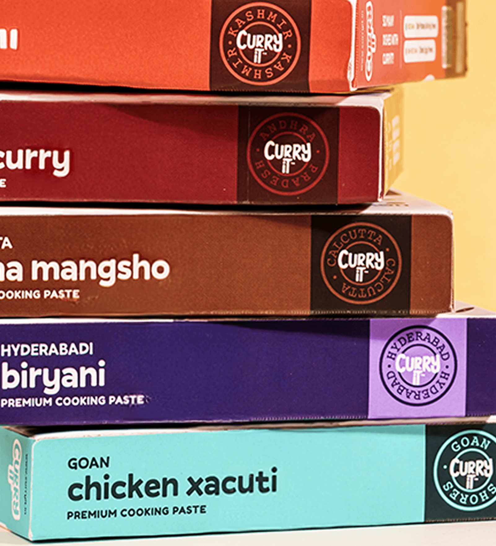
New Prouduct Range
Inspired by the brand's positioning around real taste and effortless cooking, and informed by the unique strengths of each product category, we developed a scalable packaging system that could serve diverse consumer needs. Every SKU was thoughtfully designed with its own visual cues, colour palette, and hierarchy, helping shoppers quickly navigate the range while reinforcing the authenticity, convenience, and trust that define the Curryit brand.
New Prouduct Range
Inspired by the brand's positioning around real taste and effortless cooking, and informed by the unique strengths of each product category, we developed a scalable packaging system that could serve diverse consumer needs. Every SKU was thoughtfully designed with its own visual cues, colour palette, and hierarchy, helping shoppers quickly navigate the range while reinforcing the authenticity, convenience, and trust that define the Curryit brand.
New Prouduct Range
Inspired by the brand's positioning around real taste and effortless cooking, and informed by the unique strengths of each product category, we developed a scalable packaging system that could serve diverse consumer needs. Every SKU was thoughtfully designed with its own visual cues, colour palette, and hierarchy, helping shoppers quickly navigate the range while reinforcing the authenticity, convenience, and trust that define the Curryit brand.


Identity Update
Beyond defining the brand message, we translated it into actionable initiatives and communication platforms.
This included concepts like #ActionHeroes, celebrating individuals creating meaningful impact in hygiene, care, and activism, alongside educational handbooks and guides designed to make health and hygiene knowledge more accessible. We also proposed credibility-building initiatives such as a Toilet Report Card and similar reports, helping Pee Safe actively demonstrate its commitment to making things better while reinforcing the brand promise through action.
Identity Update
Beyond defining the brand message, we translated it into actionable initiatives and communication platforms.
This included concepts like #ActionHeroes, celebrating individuals creating meaningful impact in hygiene, care, and activism, alongside educational handbooks and guides designed to make health and hygiene knowledge more accessible. We also proposed credibility-building initiatives such as a Toilet Report Card and similar reports, helping Pee Safe actively demonstrate its commitment to making things better while reinforcing the brand promise through action.
Identity Update
Beyond defining the brand message, we translated it into actionable initiatives and communication platforms.
This included concepts like #ActionHeroes, celebrating individuals creating meaningful impact in hygiene, care, and activism, alongside educational handbooks and guides designed to make health and hygiene knowledge more accessible. We also proposed credibility-building initiatives such as a Toilet Report Card and similar reports, helping Pee Safe actively demonstrate its commitment to making things better while reinforcing the brand promise through action.


Website Design
Beyond defining the brand message, we translated it into actionable initiatives and communication platforms.
This included concepts like #ActionHeroes, celebrating individuals creating meaningful impact in hygiene, care, and activism, alongside educational handbooks and guides designed to make health and hygiene knowledge more accessible. We also proposed credibility-building initiatives such as a Toilet Report Card and similar reports, helping Pee Safe actively demonstrate its commitment to making things better while reinforcing the brand promise through action.
Website Design
Beyond defining the brand message, we translated it into actionable initiatives and communication platforms.
This included concepts like #ActionHeroes, celebrating individuals creating meaningful impact in hygiene, care, and activism, alongside educational handbooks and guides designed to make health and hygiene knowledge more accessible. We also proposed credibility-building initiatives such as a Toilet Report Card and similar reports, helping Pee Safe actively demonstrate its commitment to making things better while reinforcing the brand promise through action.
Website Design
Beyond defining the brand message, we translated it into actionable initiatives and communication platforms.
This included concepts like #ActionHeroes, celebrating individuals creating meaningful impact in hygiene, care, and activism, alongside educational handbooks and guides designed to make health and hygiene knowledge more accessible. We also proposed credibility-building initiatives such as a Toilet Report Card and similar reports, helping Pee Safe actively demonstrate its commitment to making things better while reinforcing the brand promise through action.

As a health and hygiene brand there are a plethora of initiatives and campaigns that tend to derail the central messaging strategy. We strategised to ensure these could be seamlessly tied into the the larger narrative.
As a health and hygiene brand there are a plethora of initiatives and campaigns that tend to derail the central messaging strategy. We strategised to ensure these could be seamlessly tied into the the larger narrative.
As a health and hygiene brand there are a plethora of initiatives and campaigns that tend to derail the central messaging strategy. We strategised to ensure these could be seamlessly tied into the the larger narrative.
As a health and hygiene brand there are a plethora of initiatives and campaigns that tend to derail the central messaging strategy. We strategised to ensure these could be seamlessly tied into the the larger narrative.
Working with Kwazi on the brand design and communication strategy for Pee Safe was a seamless and rewarding experience. From the outset, they demonstrated a deep understanding of our category and vision, translating it into an identity that’s both bold and thoughtful.

Richa Sharma
Co-Founder @Curryit
Working with Kwazi on the brand design and communication strategy for Pee Safe was a seamless and rewarding experience. From the outset, they demonstrated a deep understanding of our category and vision, translating it into an identity that’s both bold and thoughtful.
Richa Sharma
Co-Founder @Curryit
Working with Kwazi on the brand design and communication strategy for Pee Safe was a seamless and rewarding experience. From the outset, they demonstrated a deep understanding of our category and vision, translating it into an identity that’s both bold and thoughtful.
Richa Sharma
Co-Founder @Curryit
Team
Arshdeep Singh
Brand Strategist
Swayam Dhupkar
Sr. Visual Designer
Swayam Dhupkar
Sr. Visual Designer
Special Thanks
Arshdeep Singh
Brand Strategist
Arshdeep Singh
Brand Strategist
Team
Arshdeep Singh
Brand Strategist
Swayam Dhupkar
Sr. Visual Designer
Swayam Dhupkar
Sr. Visual Designer
Special Thanks
Arshdeep Singh
Brand Strategist
Arshdeep Singh
Brand Strategist
Team
Arshdeep Singh
Brand Strategist
Swayam Dhupkar
Sr. Visual Designer
Special Thanks
Arshdeep Singh
Brand Strategist
Arshdeep Singh
Brand Strategist